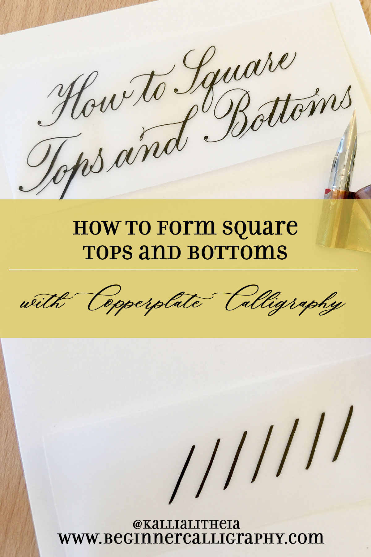
What’s the first thing you usually write when trying out a new pen? Your name? The kind of pen it is? I write all sorts of random things when I get a new pen. When you get a new pointed pen, however, the last thing you need to write is your name. Or any other word. Let’s take a look at why you should not do this. Then we will learn 3 methods for squaring your tops and bottoms with Copperplate calligraphy.

Pointed pen calligraphy–especially Copperplate–is not a running script where you just keep your pen on the paper and keep writing. Copperplate requires that you form your calligraphy one stroke at a time and lift your pen after each stroke, or maybe even more often than that.
So the first thing you need to write isn’t a word or even a letter! It is a simple—STROKE. The downstroke, to be exact. The best thing you can do in your first writing session is to practice drawing downstrokes and upstrokes. Not just a line or two, either—whole pages of them! Practice your downstroke and your upstroke until you can get them to be consistent in 1. slant, 2. thickness, 3. top placement, 4. bottom placement, 5. squared off tops and 6. squared off bottoms.
You remember from my first post about how the dip pen works, that I discussed how the pen makes these two basic strokes. Let’s review this with pictures.
- Apply gentle pressure for downstroke
- Release pressure for the hairline upstroke
This may sound like a tall order, and it is. But if you can master the downstroke and the upstroke, you’ll already be well on your way to making beautiful writing. To make this easier for you, I’ve created a getting started guide that is available for free download, and it has some worksheets in it that will give you practice not only with these downstrokes and upstrokes, but also with the other basic strokes you need to learn to write calligraphy.
You may notice that these strokes are very squared off at the tops and bottoms. In a minute we are going to look at how exactly to make this shape with your pointed pen. First, though, there is another thing I have not mentioned before that you really need to understand before you go any further.
The Anatomy of the Guidelines
You need to understand the terminology associated with the guidelines so that you will understand the descriptions of how to make certain strokes and letters. So let’s take a brief look here at the guidelines.

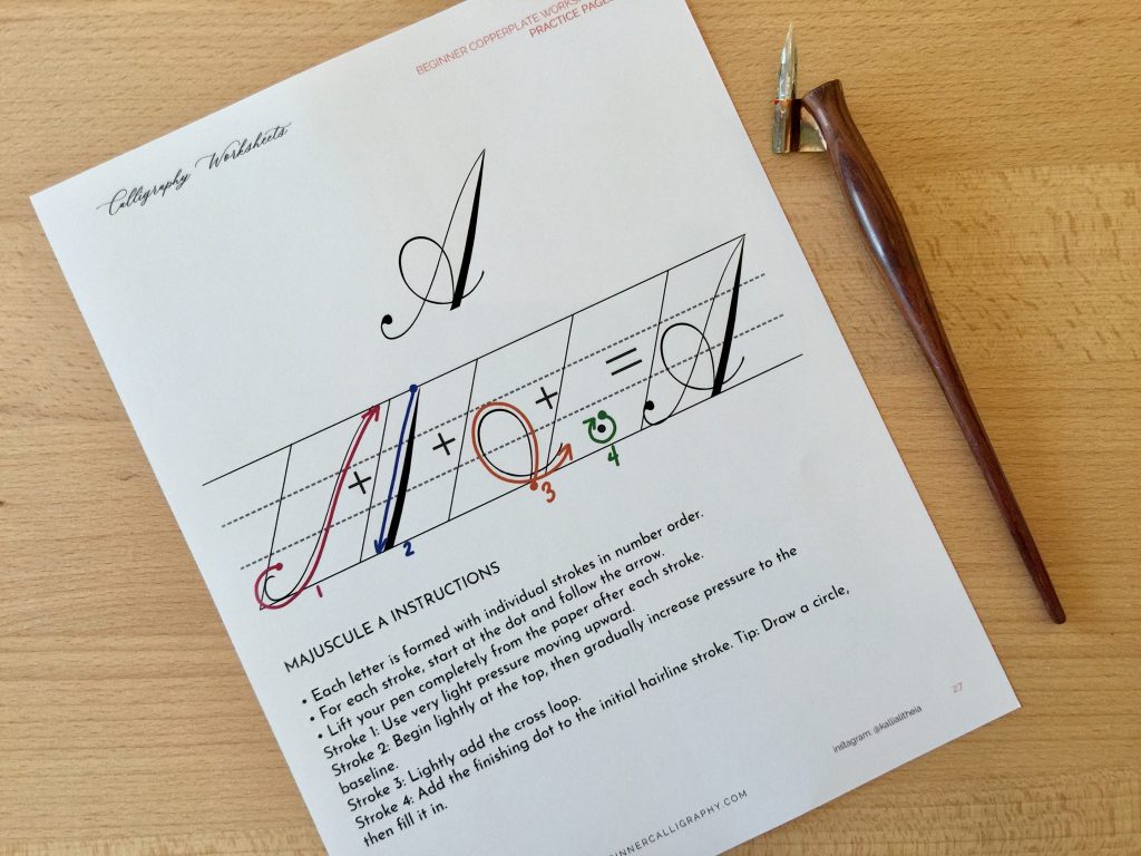
The above diagram of the guidelines is taken from the informational section of my Majuscule Practice Pages workbook. The Practice Pages workbook, available in my Etsy shop, is a printable PDF that gives you entire tracing pages for every majuscule (uppercase) letter of the Copperplate alphabet. In addition, it has an instructional page devoted to each letter as well, where it shows an enlarged version of the letter broken out into strokes with directional arrows and written explanations.
Here is a sneak peak of two pages out of that printable workbook:


Within that workbook is an explanation of each of these parts of the guidelines, as well as a step-by-step guide for the very beginner of how to start learning calligraphy. Now that you’ve seen this guideline anatomy in detail, let’s move into the mechanics of squaring those tops and bottoms.
How to Form Square Tops and Bottoms in Copperplate Calligraphy
You may have noticed that in traditional Copperplate writing the tops of strokes like the d and the t and the underturn are very squared off. This seems to be a very difficult thing to learn how to do, but really it is quite simple. The tines can do the work for you!
In one method, forming square tops requires turning the nib/pen in a very specific direction to allow the tines to spread apart in such a way as to naturally form a straight, squared off top. This is more easily learned by watching a video. I created a video for you to demonstrate 3 different methods for forming square cutoffs in your calligraphy strokes.
Video Transcript
In Copperplate Calligraphy, there is more than one way of making the tops and bottoms of your strokes squared off. In this video, I am going to show you three different methods.
Method One for Square Cutoffs in Calligraphy
In the first method, which for me produces the nicest result yet seems to be the most difficult, you let your tines do the work for you.
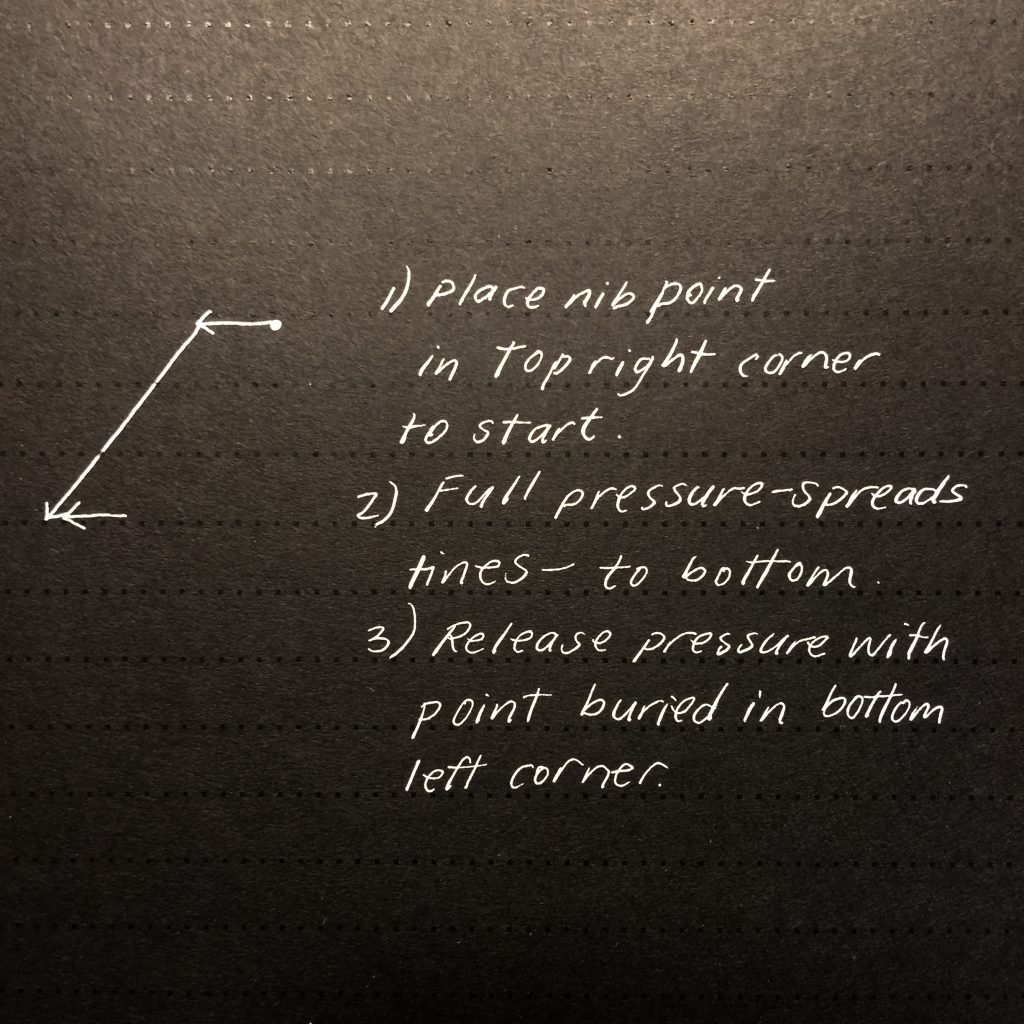
Place your nib point in the top right corner to start. Apply full pressure, causing the nib tines to spread apart. Pull the stroke down to the baseline with that same full pressure. Release the pressure quickly at the baseline, allowing the tines to snap back together, lifting at the bottom left corner.

This method requires me to manipulate my pen in a steeper angle of pen-to-paper than I prefer to write.
Method Two for Square Cutoffs in Calligraphy
In the second method, draw a fine line from the top left corner to the top right corner the thickness of the stroke, then apply full pressure, pulling down the baseline. Again, release the pressure quickly at the baseline, with the point buried in the bottom left corner, allowing the tines to snap back together. Theoretically, they should draw a nice straight bottom as you do this. Touch up the bottom as necessary.

Method Three for Square Cutoffs in Calligraphy
In the third method, start at the top right of the stroke, just below the corner. Lightly draw a very small line upward to the top right corner, then over to the top left corner, and apply full pressure, pulling stroke to the baseline. Finish the bottom the same as for the first two methods. Again, you may need to touch up the top and/or the bottom using this method.

You will notice in this method that my pen hold has shifted. This is the way I normally hold my pen, so this is the most comfortable position for me, with a shallower pen-to-paper angle. Also notice that in the diagram above, the distance of the first upward line to draw is exaggerated so that you can see it. When actually making the stroke with a pointed pen, it is very, very small.
Learning to square your tops and bottoms can be challenging, and I recommend experimenting with these methods to see which works the best for you. I recognize that these methods are easier in theory than in practice, but I want to encourage you to experiment with manipulating your pen into different angles from pen to paper as well as rotating the nib slightly until you are able to find that perfect position to make the squared tops. That is, if squared tops are important to you! There’s no rule that says you must always square your tops, unless you are working on earning a master penman certificate!

If you’d like to get some guided practice on making these strokes in the context of letters, you would enjoy my Beginner Copperplate Complete Set of calligraphy worksheets. These worksheets have tracing letters and freehand room for all of the uppercase and lowercase letters, numbers and punctuation, and combinations practice. This is the ideal set for the beginner calligrapher. And if you would like to get a 10% coupon for this set, subscribe to my mailing list before you purchase it.
The Calligraphy Basics Series
Hopefully you’ve already read my other articles in the Calligraphy Basics Series. If not, I encourage you to do that, because I walk you through every detail of getting started with Pointed Pen Calligraphy.
Here are those articles:
The Basics of Dip Pen Calligraphy, Part 1
The Basics of Dip Pen Calligraphy, Part 2
The Basics of Dip Pen Calligraphy, Part 3
The Best Pointed Pen Nib for Beginner Calligraphy
Getting Consistent Slant with Calligraphy
How to Form Square Tops and Bottoms With Calligraphy (this article)
I’m excited that you have joined me on the adventure of pointed pen calligraphy. Hopefully this series on Dip Pen Basics has given you some foundational information to help you as you get started with calligraphy. There are many resources available online for little or no cost, and I’m here to help you find them. In addition, the calligraphy community is very active on Instagram and is always welcoming and generous with advice and tutorials. I hope you will follow me there and begin to connect with other aspiring calligraphers as well.
Did you enjoy this article? Be sure to pin it so that others can benefit as well.


